AUDACY
Audacy is a free broadcast and Internet radio platform developed by the namesake company Audacy, Inc.The Audacy platform functions as a music recommender system and is the national umbrella brand for the company's radio network aggregating its over 235 local radio stations across the United States. I was tasked with redesigning Audacity Inc. involves creating a cohesive brand identity, enhancing the user experience, and modernizing its visual assets to reflect its innovative spirit while retaining its core values of accessibility and community-driven development.
Client: Audacy
Focus: UI/UX, art direction, visual design
problem
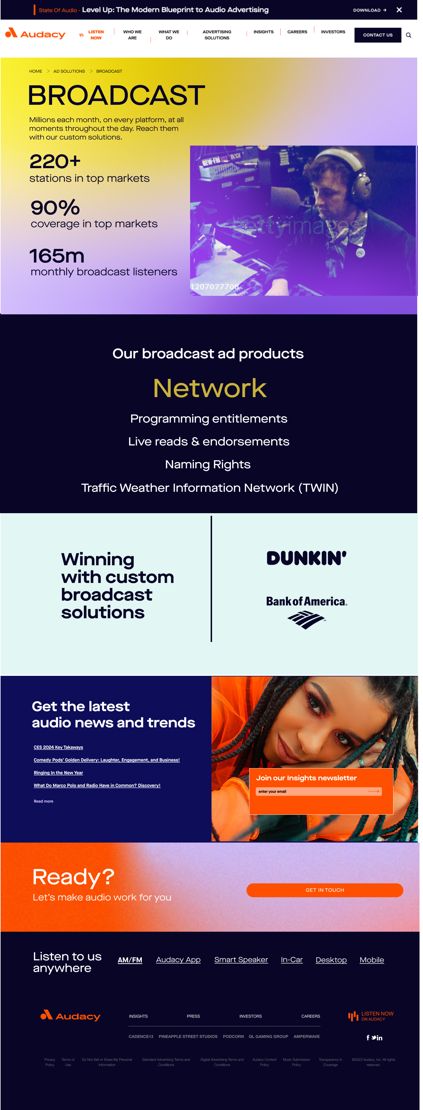
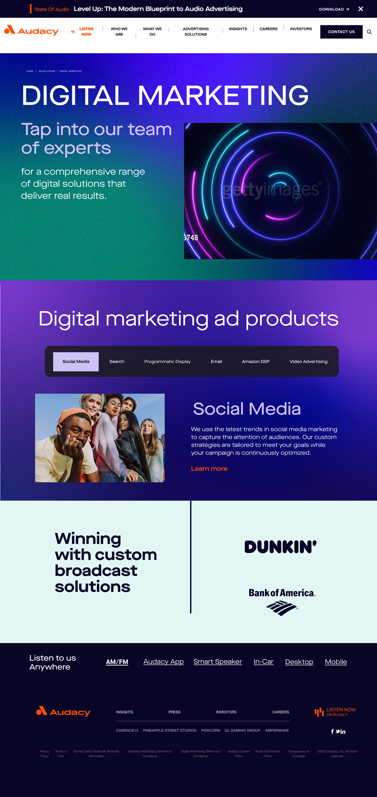
1.Inconsistent Color Flow
The page used a wide range of bold background colors—deep blue, yellow, purple, teal, and more—without a clear logic or rhythm. While each block was visually striking on its own, the overall experience felt disjointed. The abrupt transitions between high-contrast sections disrupted visual continuity and diluted the strength of the brand's palette.
2. Overwhelming Visual Hierarchy
Nearly every content block was styled as a primary feature, with heavy use of bold typography, all-caps subheads, and vibrant blocks competing for attention. This resulted in a lack of clear priority across the page, making it difficult for users to quickly scan and understand what mattered most.
3. Layout Imbalance
The design relied on asymmetrical grids and boxed sections with varying widths and paddings, which led to a visual imbalance. Some modules felt cramped, while others had too much negative space. This inconsistency made the page feel busy and unstructured, especially on scroll
Solution
Consistency in Visual Identity: Update the brand’s visual elements—logo, color palette, typography—to ensure a cohesive look and feel throughout the site. This includes selecting colors that evoke the brand's personality and values, and typography that enhances readability while reflecting the brand's voice.
Imagery and Graphics: Don’t underestimate the power of high-quality images and custom graphics. Integrating branded illustrations or photography that resonates with the target audience can create a stronger emotional connection and improve overall aesthetics.
Functional Improvements
User-Centered Navigation: Redesign the navigation menu to facilitate ease of use. This could involve simplifying categories and subcategories, ensuring that users can find relevant content quickly. Implementing a sticky navigation bar can enhance accessibility as users scroll.
Responsive Design: Ensure the site is fully responsive across all devices. A mobile-first approach can improve usability and engagement, as many users access websites from mobile devices.
Enhanced Call-to-Action Elements: Revise the call-to-action buttons to be more prominent and actionable. Use contrasting colors and strategic placement to guide users smoothly toward key interactions, such as signing up for a newsletter or accessing services.
Interactive Features: Incorporate interactive elements such as hover effects, animations, and dynamic content that respond to user input. This can increase engagement and make navigation feel more intuitive.
Performance Optimization: Ensure fast loading times by optimizing images, utilizing efficient coding practices, and leveraging content delivery networks (CDNs). A smooth performance enhances user experience and reduces bounce rates.


